ICT: The e-book
Let’s start with spreadsheets. Often found in a commercial setting, these powerful programs can model the real world and carry-out hundreds of potentially tedious calculations at the touch of a button.
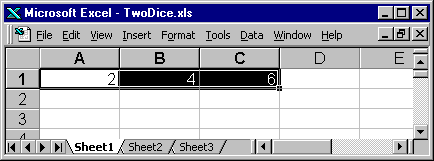
For example – what if we wanted to find the commonest score with two dice? Rolling the dice and adding the two top faces together might be amusing ten or twenty times – but what about sixty times? Or even three hundred and sixty times? Click on Twodice1.xls and save yourself the trouble!The copying (or replication) technique is to select the top three cells,

then hover over the bottom right-hand corner and drag downwards:
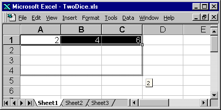
Keep dragging for 360 rows!
Fine, but how do we find the most common, or modal, score? Clicking on the ‘Sheet2’ tab towards the bottom of the screen, you’ll find another formula that gives us the answer.
To gain more control over the throwing of these dice, choose Tools on the menu bar, then Options, Calculation, Manual and NO ‘Recalculate before save’:
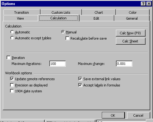
Pressing the ‘Function Key’ F9 (usually at the top of the keyboard) will throw all the dice again at the "touch of a button"!
Taking a closer look at our formulas, we notice that, within Microsoft Excel, they all begin within an equals sign. Other important symbols include the ‘times’ sign (an asterisk *), the divide sign (an oblique, or rather less elegantly, a forward slash /) and the ubiquitous brackets (). The last formula we used incorporated the ‘mode’ function which found the commonest score by placing the range of our scores within brackets; Mode(C1:C360) means find the most common number of those listed in Column C.
Other useful functions can be called up by clicking the

button and the first formula on the sheet uses two of these (INT and RAND to provide random whole numbers) but the second formula (in Column C) simply uses the familiar plus (+) operator between two cell references; A1+B1 means add the contents of the cell at ColumnA, Row1 to the contents of the cell at ColumnB, Row1 (and put the results in ColumnC, Row1).
This simple formula, though, allows us to discuss the important notion of relative references – they changed automatically as you copied the formula down the screen. Notice, for example, that the formula in Column C Row 10 is A10+B10. To prevent any changes as a formula is copied, absolute references are used. (Try putting =$A$1+$B$1 in cell C1 and copying down.)
Should we want to draw a bar chart of our results, then some analysis of our data is necessary. First of all, we need to add-in the data analysis ‘toolpak’:
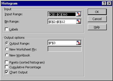
On Sheet3 of our Excel spreadsheet, you can see the results of using this facility. Notice that a list of all possible outcomes has been made in column E (called the Bin Range). To obtain your own chart (sometimes called a histogram), try using Data Analysis on the Tools menu. The appropriate Dialog Box has been filled out below:
You might have noticed that a small amount of formatting has taken place. The legend (or ‘key’) has been cleared, a heading has been inserted and the labels on the horizontal axis have been ‘re-aligned’. Each time, right-click with the mouse pointing to the appropriate feature in order to bring up a menu.
The results of our experiment could be displayed as a pie chart. We can click on the charts icon
![]()
and select a pie chart. The critical second step in the process, which uses the table of results from our earlier data analysis, is shown below.
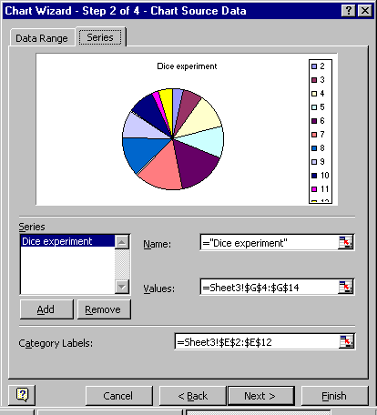
The resulting pie chart is shown within Sheet4 of ‘TwoDice1’.
Another oft-used chart is the scatter diagram. With this, a link between two sets of data can be shown pictorially. If we collected the shoe sizes and heights of a group of individuals, Excel will easily draw not only the scatter diagram but also (again by right-clicking the chart) a trend-line. The results (using real data) can be seen by loading Htandss.xls.
We ought not to leave discussion of this spreadsheet without experimenting with more formatting tools. By selecting the data (text or numbers) within the sheet, subsequent clicking on an icon can change its appearance (eg to Bold, Italic or Underlined) and its position (eg aligned left, right or centred) but, more interestingly, the data may be sorted by selecting all three columns (drag on A,B,C) and clicking on the Data menu. The dialog box will allow you to sort by Column B (Height), for example, and allow a further sort by Column A (Initials) for persons with the same height.
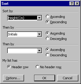
Notice that choosing to sort in a ‘Descending’ manner means that heights lessen as you pass through the file. Choosing ‘My list has a Header row’ means that your column headings won’t be sorted along with the rest of the data!
Now, as more of a challenge, let’s consider this puzzle sent in by a reader of the Express & Star:
Andy's savings came to one less than twice the square of the difference between the pence and the pounds, all in pence. Given that his savings were less than £200, how much were they?
Now if the time is not right for this type of teaser, just follow this attempt:
Start with £12.10, say. The difference between the pence and the pounds is 12-10 which is 2. The square of this is 2 times 2 which is 4 (well it was 4 yesterday). Twice this is 8. Take away one and we’re left with 7 pence. Not the 1210 pennies that we started with.
Try another? Why not use a spreadsheet: –WhatIfDemo1.xls.
You will see that on Sheet1 we have tried £12.11 and £12.09 and neither seems to work. It is possible to try some more numbers, but a "What If" tool, called Solver, is available to us. Again, it might have to be installed as an ‘Add-In’, but the setting-up is done for you on the second sheet. Notice the answer of £199.99, that thankfully agrees with that of the Express & Star. But there is at least one other. If Solver is set to find a minimum value for the solution, it comes up with £52.01,
Do please check it for yourself!